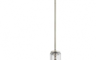
For our new space we carefully considered the lighting for each room. This was probably the hardest part of the design to get together. While there are millions of options out there, finding something that fits the building, our taste and the budget proved a challenge. We wanted the new lighting to match as well as match the rest of the building. It needs to be both historic and modern.
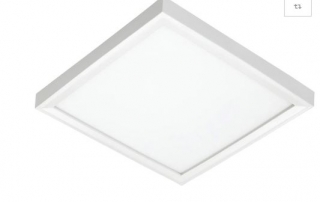
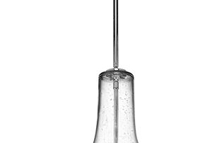
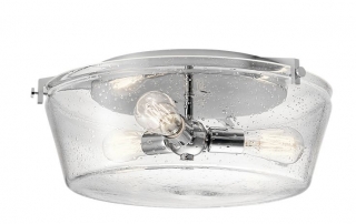
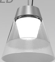
We have decided on a classic silhouette of seeded glass to replicate a blown glass fixture with brushed nickel finish for the primary fixture family. The entry will be a pendant with a single lamp. The studios and conference room will be pendants with 3 lamps. For the upstairs offices we switched it up and decided on flush mounts from the same family but with the antique nickel finish. The bathroom will have a dual goose neck fixture with the clear seeded glass light shades. Mercer Zimmerman, our go-to lighting company, generously gifted a modern pendant light. It was used as a traveling show piece and will now light up our kitchen. The library will have modern white square flush mounts to keep a low profile.
Lots of choices to make, but we feel good about things and can’t wait to see them installed.


